What Typefaces
Would Sound Like
If They Were
Songs
Fonts convey emotions
Have you ever looked at a typeface and felt it conveyed a specific feeling? It might seem unusual, but fonts carry personality. According to Design Modo, “Fonts can evoke a wide range of emotions, depending on their design characteristics.” Before we even read the words, a font can shape how we feel about them, just like a song or an image does. When using different fonts in design, it’s important to recognize how they influence perception. As Envato explains, “Using different and powerful fonts can instantly shift the personality and psychological impact of your designs, leading to more effective branding decisions.” Once you start understanding how fonts feel, you begin to see them not just as design tools but as emotional cues.
How fonts feel
As I began looking at the most popular typefaces, I began imagining what they felt like. I took in the style, line weight, and even the spacing. While thinking about how I felt, it got me thinking. If fonts were songs, what would they sound like?
Times new roman
Nocturne No. 2 in E-flat Major by Frédéric Chopin

Times New Roman is a a typeface that is a“ classic and traditional font that conveys reliability, authority, and seriousness.” Times New Roman has this classic, structured elegance, much like Chopin’s Nocturne No. 2 in E-flat Major. Both possess a timeless, refined quality with a subtle depth that evolves over time, much like how Times New Roman, though simple, carries a strong sense of tradition

Works Cited
Buchholz, Carrie. “The Psychology of Fonts: How Typefaces Shape Emotion & Influence Design | Skillshare Blog.” Skillshare Blog, 25 Mar. 2025, www.skillshare.com/en/blog/the-psychology-of-fonts/.
“FONTS.” Chris Costello, 26 Apr. 2020, chriscostello.design/fonts/.
Fussell, Grace. “The Psychology of Fonts (Fonts That Evoke Emotion).” Envato, 16 Feb. 2024, elements.envato.com/learn/the-psychology-of-fonts-fonts-that-evoke-emotion.
Shu, Hua. “How to Use Montserrat: A Wide Font for Branding.” FontDiscovery, Hua Shu, 25 Oct. 2024, typogram.co/font-discovery/how-to-use-montserrat-font.
Svaiko, Gert. “Font Psychology: Here’s Everything You Need to Know about Fonts.” Designmodo, 12 Jan. 2023, designmodo.com/font-psychology/.
Team, Adobe Acrobat. “What Font Matches Your Personality? | Adobe Blog.” Adobe.com, 2024, blog.adobe.com/en/publish/2024/10/31/what-font-matches-your-personality.
Wirawan, Ervan M. “A Story behind Comic Sans, (Probably) the Most Notorious Typeface.” Uxmarker, 1 May 2019, medium.com/uxmarker/a-story-behind-comic-sans-probably-the-most-notorious-typeface-49c812264d5d.


Papyrus “merges the elegance of traditional Roman letterforms with the hand-crafted feel of calligraphy.” "Now We Are Free" fits the ancient vibe because it has a big, timeless feel. The voices and orchestral music make it sound like an old, epic story. It feels like it’s connected to something from the past, just like ancient myths or legends.
Comic sans
The ABC’s
Comic Sans is a “whimsical font inspired by comic book lettering and creates a friendly, informal vibe. It's often used in child-focused designs or informal settings.” Like Comic Sans, the ABC’s are not serious, just playful and light, making it perfect for something everyone can sing along to. Both are easy to recognize and kind of silly.
Montserrat
Blinding Lights by The Weeknd
Montserrat has a “bold, modern aesthetic…It brings a sense of innovation and boldness”. Both have that clean, modern vibe. The song is upbeat and smooth, just like how Montserrat is bold but still simple and easy to read.
Papyrus
Now We Are Free By Hans Zimmer
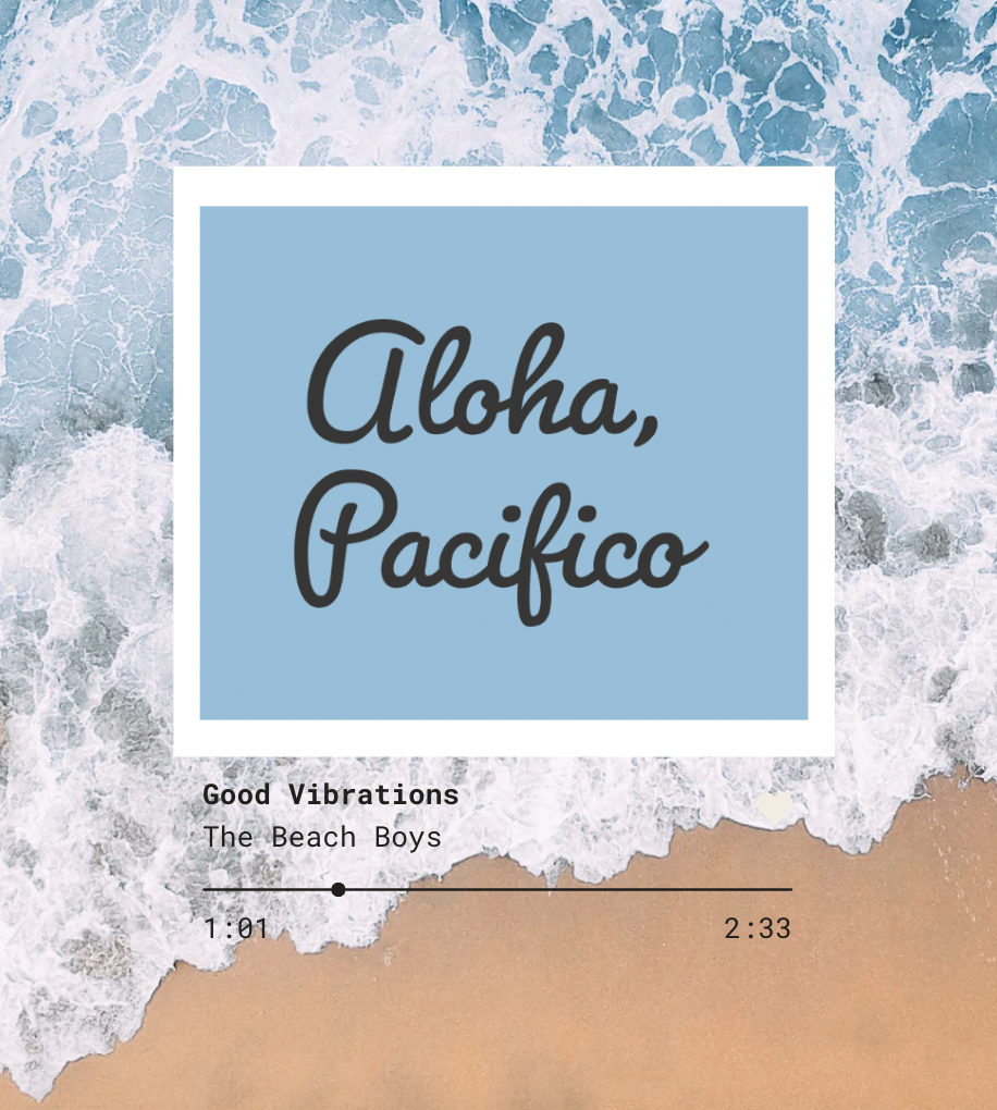
Pacifico is a “relaxed and playful script-style font that feels friendly, informal, and creative.” "Good Vibrations" by The Beach Boys fits Pacifico because both feel retro, upbeat, and carefree. The song’s sunny vibe matches the font’s smooth, handwritten style.
Pacifico
Good Vibrations by The Beach Boys