
Making Insight Accessible
The redesign of Hechinger report’s website
Who is Hechinger report?
The Hechinger Report is a nonprofit, independent news organization that focuses on in-depth journalism about education.
Founded in 2010
Part of Teachers College, Columbia University
Named after Fred M. Hechinger, a longtime education editor at The New York Times
Reports are often republished in major news outlets like The Washington Post, NPR, and The Atlantic
Covers both U.S. and global education trends
Their mission is:
“to keep the public informed about one of the nation's most important institutions during a time of immense economic and political change”


Website problems
Currently, the website is one long scroll with difficult navigation.
Alongside this, the main navigation menu only includes “Newsletters,” “About,” and “Donate,” while all other content categories and links are placed at the bottom of the page
This can make it hard for users to quickly find the information they need.
From my notes:

This makes it difficult for users to easily access specific articles or topics. The site may also not be as easy to use on mobile devices, which is important since many readers access it that way.
Without a more structured navigation system, users might struggle to find relevant content quickly, making the experience less convenient
Finding The Target Audience
Before looking at ways to redesign, it’s important to understand who the website will be for.
Before looking at ways to redesign, it’s important to understand who the website will be for.The Hechinger Report serves a broad range of readers interested in education policy, innovation, and equity.
These people would be:
Teachers, principals, school administrators, education policymakers, and education students
To stay informed on best practices, innovative teaching methods, and education reform that impact education
Families, Parents, Students
To understand trends in college affordability, curriculum changes, student well-being, and things impacting education
The Public
For data-driven insights, case studies, and expert opinions on learning trends and education challenges
Why Does This Matter for User-Centered Design?
The content and website experience should be easy to navigate, highly informative, and accessible to the target audience and overall readers
It should be mobile-friendly since many readers will view it on mobile
The format and data on the website should cater to the target audience because they will be accessing the website the most
Goals & Objectives
The main goal would be to improve user experience by making the website easier to navigate, organizing content more clearly, and ensuring it works well on all devices.
To be more specific:
Better Navigation: Add a more complete and visible menu with important categories so users don’t have to scroll to the bottom to find what they need
Clearer Content Organization: Arrange the homepage into more relevant and organized sections that make it easier to find and read articles
Adding Topic Section to Home: Add features, such as recommended articles or topic filters, to help users discover related content
User benefits:
Users can find articles and information more easily
A clearer menu helps users quickly get to the topics they care about
A mobile-friendly design makes reading and browsing smoother on any device
A more interactive experience helps users explore and discover relevant articles
Understanding the current site
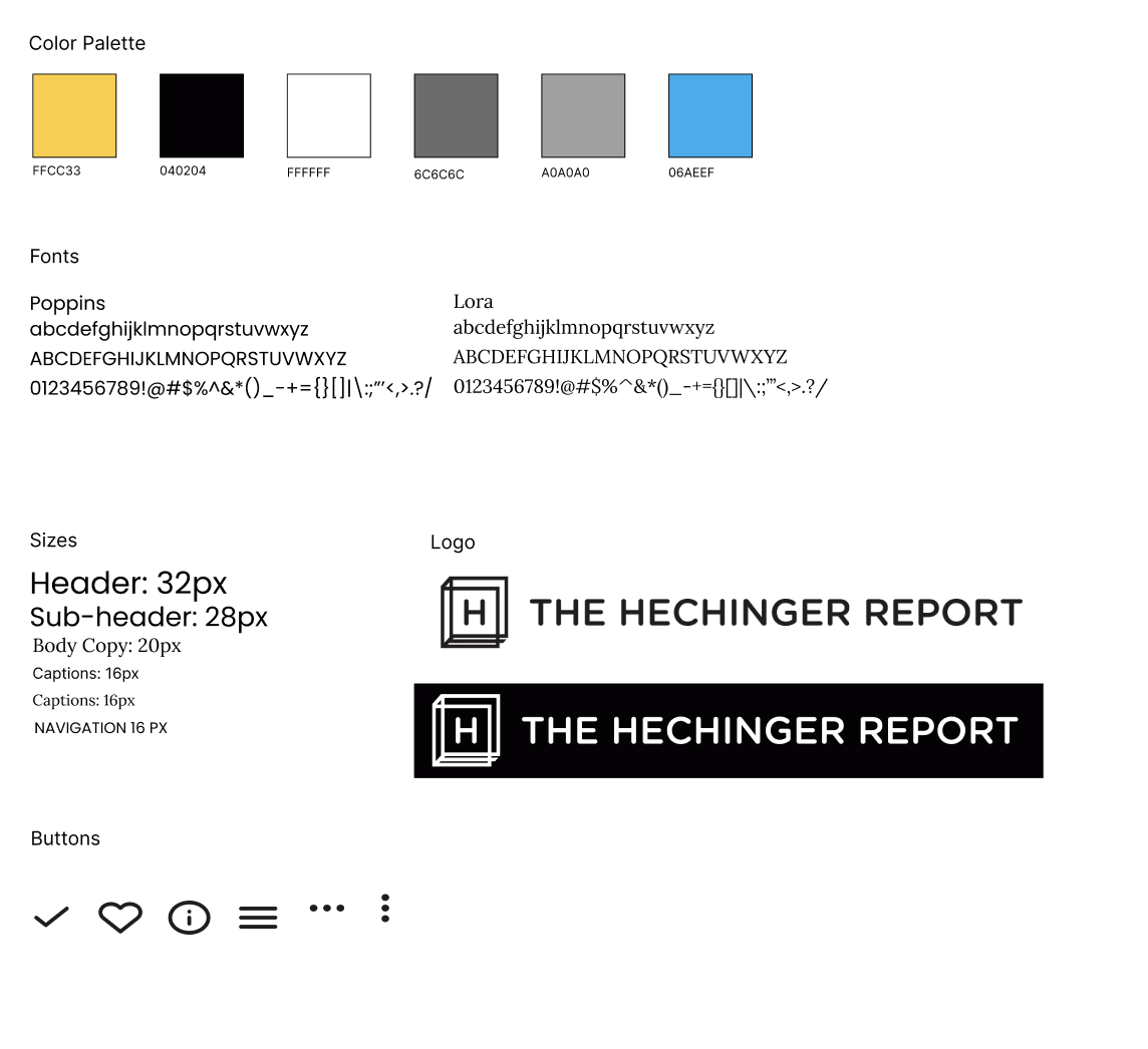
Using the Google Chrome extension “what font,” I was able to see all the fonts and sizes of the site.

Then looking at the logo used in the site header, I saw only words were used without their logo. After doing some more research on the site I saw that the Hechinger Report did have a logo which was only used on the ‘donate’ page on their website.
Creating a UI kit
After understanding the fonts and sizes, I made a UI kit with all the physical details of the site.
This included:
a color palette
Type faces
Font sizes
Logo variations
Buttons
Since the site’s fonts weren’t freely accessible, I opted to use a sans serif and serif font that were the most similar to the fonts on the page.
To make my life a little bit easier, I put all this information into Figma’s system so that I could access it with the press of a button instead of having to check every single time

Navigation and IA
To understand how I want to lay out the redesign, I made a mind map with the information architecture .With this, I added topics to the navigation and organized the homepage in a way that made more sense.

Sketching, Sketching, Sketching
After thinking about how I wanted to lay out the website, I took to the drawing board to visually see how it would all be put together. I included multiple variations that I could mix and match to make the site right


To figma
While understanding the current fonts and sizes, I realized another issue on the site. Something the site lacked the most was consistency.
There were over 8 font sizes being used, with many of them being inconsitent for the same type of text.
While going through this process, I narrowed down the font types and sizes to 4 different variations so the redesign would have more consistency.


